Role: UX Designer& Researcher
Timeline: One week
Tool: Figma
About the Project
I chose to redesign the PayPal sign-up and onboarding process as part of a UX design challenge focused on competitive analysis. While creating a new PayPal account, I personally encountered several confusing steps in the user journey. This experience highlighted usability issues and presented a valuable opportunity to rethink and improve the onboarding flow for a more seamless user experience.

Design Process

As a regular technology user who has a lot of experience signing up for an account for various types of platforms, and a new user of PayPal, I noted down anything I noticed and my first impression while I was signing up for a new account.
After all my findings and the first impression gathered, I used a rating system of 1-5 to perform a heuristic evaluation to list out all the usability problems and what needs to be fixed.

Heuristic Evaluation
I do not agree that this is a usability problem at all

Cosmetic problem only: do not need to fix unless extra time available time on project
Minor usability problem: fixing this should be given low priority
Major usability problem: important to fix - high priority
Usability catastrophe: imperative to fix this before product can be released
Set up your profile
Flexibility and efficiency of use
Users would assume that they need to fill in all the fields as it did not indicate if all fields are required, eg some people may not have a middle name
I successfully continued to the next page without filling in my Middle Name, but got me thinking if DOB and Occupation are required as well, could’ve saved more time if they are unnecessary

Add your address
Help and documentation
The address is powered by Google, which is very convenient, but if the user lives in an apartment or a townhouse, he/ she would not be able to enter their apt/ suite no.
Consistency and standards
‘Address line 2” is for apt/ floor/ suite/ room, but this is not the usual field where I input this information, there is a possibility that users would get confused


Create your username
User control and freedom
Once users landed on this page, they are not able to go back to previous pages. If users are not supposed to go back to previous pages, there could be a pop-up message to remind users
Error prevention
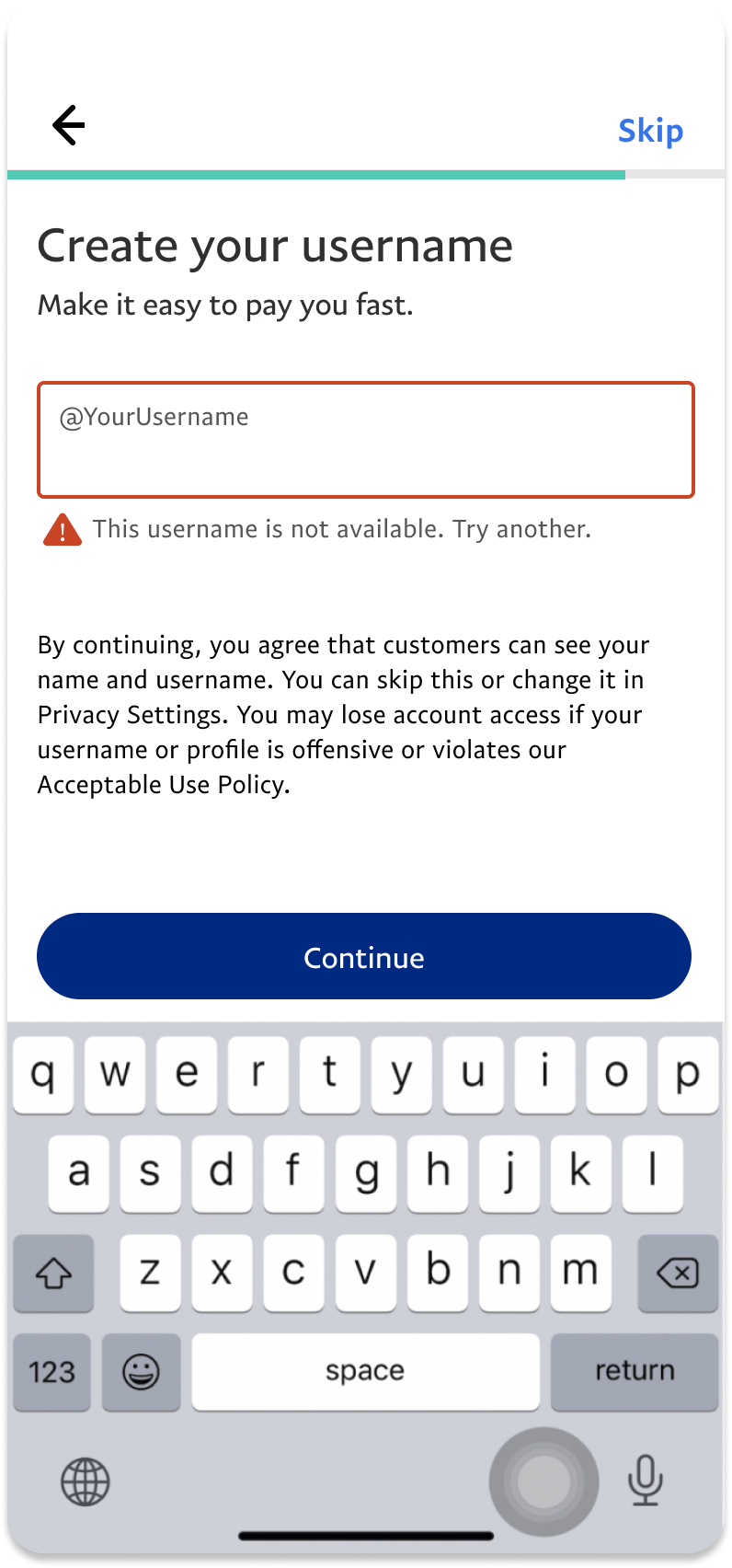
The PayPal system generates usernames for users automatically, but an error message also shows up as the chosen username is not available - which is a bit awkward for me
Consistency and standards
‘You’ll need a username to continue.’ and ‘Skip’ - so can I skip this part? will I have/ need a username to continue? Will I be able to change my username later?
Warning message only shows up when the user entered an available username - would a user still skip this part when they already created an available username?- still doesn’t explain what would happen if i skipped this part now


Stay in the know/ Push Notification
Match between systems and the real world
Not a good idea to ask for users’ permission to send push notifications during the onboarding process as there may not be a need for users yet. Studies show that most users tend to disable push notifications if they were asked to during onboarding

User Persona

After the heuristic evaluation and some research about Paypal, I listed some assumptions and constraints of the target users, then created a user persona
Assumptions:
Users are familiar with mobile banking apps but are not familiar with person-to-person payment mobile app
Assuming users are working professionals and are familiar with signing up new accounts on different platforms

Sketches
Questions to keep in mind:
What is the necessary information required from users?
What is the information we need to disclose to users while they are signing up?
How to help users easily understand what they need to do, and why they have to do so?
What are the design patterns that should be applied in the design to improve the experience?


Set up your profile
To avoid confusion and save user’s time, [optional] is added to fields that do not require users to fill in
Before
After


Add your address
Instead of [Address line 2], use [Room/ suit no.] to indicate the type of information users are expected to provide
Before
After


Create your username
Avoid automatically generating an username for user, especially if automatically generated usernames could be unavailable
Before - Landing Page
After - Landing Page


Either keep the [Skip] button or [You’ll need a username to continue.] to avoid confusion
Before - Username
After - Username


The warning message [By continuing, you agree that...] will show up as soon as users land on this page, not after users entered an available username
Before - Warning message
After - Warning message


Enable push notifications
Ask about enabling push notifications when users took actions, eg sending/ requesting money from people
This adds a sense of urgency and is more relatable to users, and eventually increase notification rates.
Before
After

