About the Project
In this project, I picked a local business in my area and challenged myself to redesign its website. The local business I picked is a floral shop named Forget Me Not Floral Design, it creates floral arrangements and offers nationwide delivery.
Key Objectives:
Increase click rate - attract more visitors to explore the website
Refresh the layout of the website - Content & UI
Analyze
Before I started redesigning the website, I analyzed the website to understand what needed to be redesigned. I went through the entire website and noted down my first impressions and the potential problems of the website.
Potential Issues:
Two navigation bars make it confusing and difficult to use
UI is outdated
The negative space of the background is distracting, the floral background is busy and takes attention away from the products
Missing hero line/ image to set the brand personality/ tone
I also broke down the page layout to better view the content and placement of the current website. I noticed the hierarchy is messy and some content is repetitive. For example, the Main CTA and About Us are repetitive and distributed in different sections. I think this design fails to deliver the brand personality and message clearly to the audience.
Current Website
Website Breakdown
Ideate
After understanding the issues, I listed out the key issues that needed to be changed or enhanced, then went ahead to sketch out a wireframe.
Design Objectives:
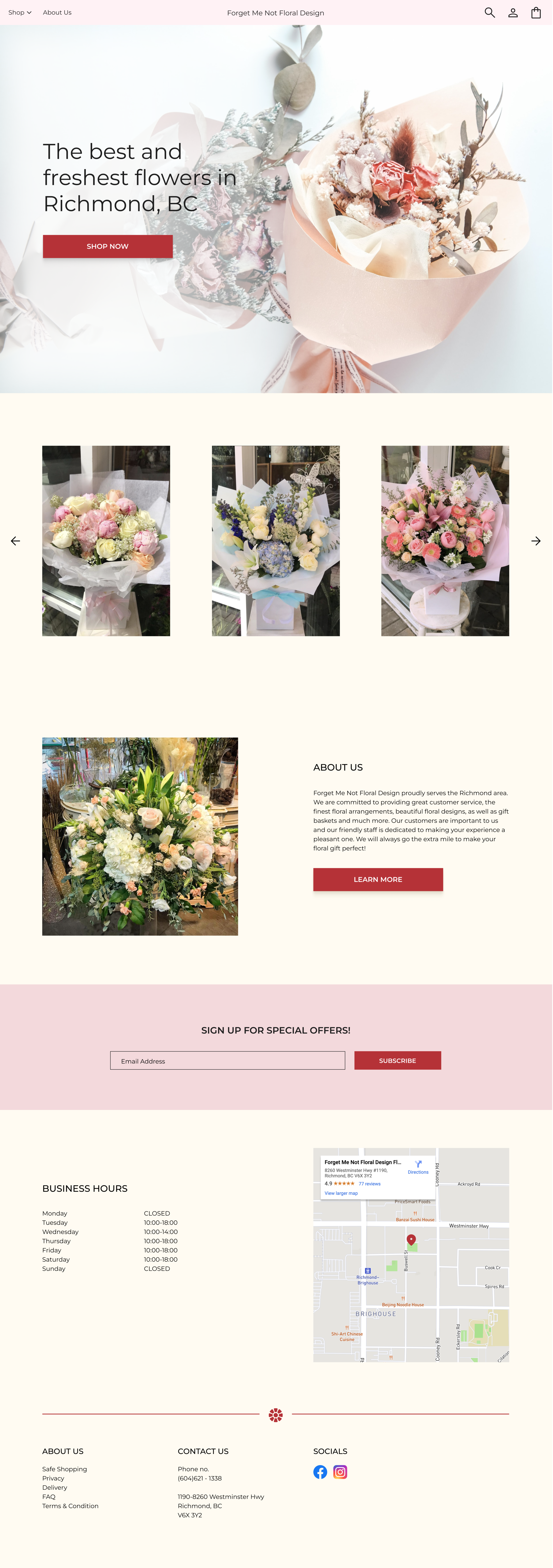
Set the brand tone by adding a hero banner
Condense the content while presenting enough information that attracts the audience to stay on the page
Reduce distractions and focus on presenting necessary information (eg. Who are we, the products)
Homepage - hero banner
Product Gallery
About Us
Newsletter
Business information - business hour and location
Footer
The Design
Hero Banner
A hero banner is used to convey the brand’s image and give visitors an idea what to expect in this website.
Product Gallery
As a floral design shop, the visual is the most important element of the website. Visitors are more willing to spend more time on the website if they like the floral arrangements.
Therefore, most of the text from the homepage is removed and more focus is placed on the visuals.
About Us
The About Us section is condensed into one paragraph. If visitors are interested in learning more about the shop, they can use the ‘Learn More’ button that leads them to the dedicated About Us page.
Newsletter Subscription
The subscription section is enlarged to draw visitors’ attention, increase the engagement rate and allow the shop to manage the business easier.
Business Information
Business hours and shop-related information are important as these are the things visitors care about and would need to know in order to purchase offline.
Footer
The footer is simplified and social media handles are also moved in the footer as it’s more common to users.


