Birdymart
Redesign and enrich the product’s feature-set to enhance the user experience
Role: UX & UI (research, interactive design, visual design)
Project: Redesign app experience for Bindo Labs Limited
Timeline: February 2022 - June 2022
Introduction
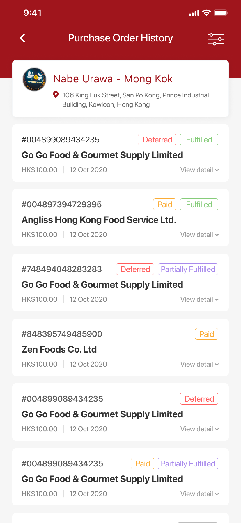
Birdymart is a B2B platform for purchasers to order supplies and goods whenever they need. It also allows purchasers to defer order payments and pay for selected orders or all orders at the end of the month. Our client aims to launch Birdymart on over 12 brands and 30+ restaurants across Hong Kong.
My challenge was to redesign and enrich the product’s feature-set to enhance the user experience. With the Design Thinking method, I set out to design a solution that would meet the needs of the target user, the objectives of the company and technical capabilities.
Research
To understand the project more, I studied the application and had meetings with the client to identify their objectives, the users’ behaviours and to understand their feedback on the current Birdymart application.
Insights

Share feature required
Users are unable to send their order details to necessary parties

Non-User Friendly
Time consuming and users are not able to complete tasks efficiently

Non-Intuitive design
Users struggled to understand how to use the app without assistance


How Birdymart user interface used to look like
“It took us more time and effort to order on Birdymart comparing to our existing method, which is calling suppliers one by one to place orders.”
Analysis
After discussing with different stakeholders, including the client, purchasing agents (represents users) and designers, I also had a better understanding of the actual users’ behaviours. I learned that some restaurants are required to send their orders and invoices to specific parties for documentation purposes.
Also, restaurant workers tend to have a busy schedule and very limited time to work on administrative works such as organizing documents and placing orders. It’s necessary to create short cuts so to help users to be more efficient when placing orders with Birdymart.
I then created new user stories to help me work on the users' actual pain points, and listed out major pain points pointed out by users.
User Stories
As a purchasing agent, I am required to send all invoices, and purchasing history to the finance department for documentation
As a frequent user, I want to be able to find items, and invoices easily and efficiently
The Problem

Unable to search for items
Ordering process is unclear
Unable to remove/ adjust items
Order amount is too small
Not all information are necessary for users
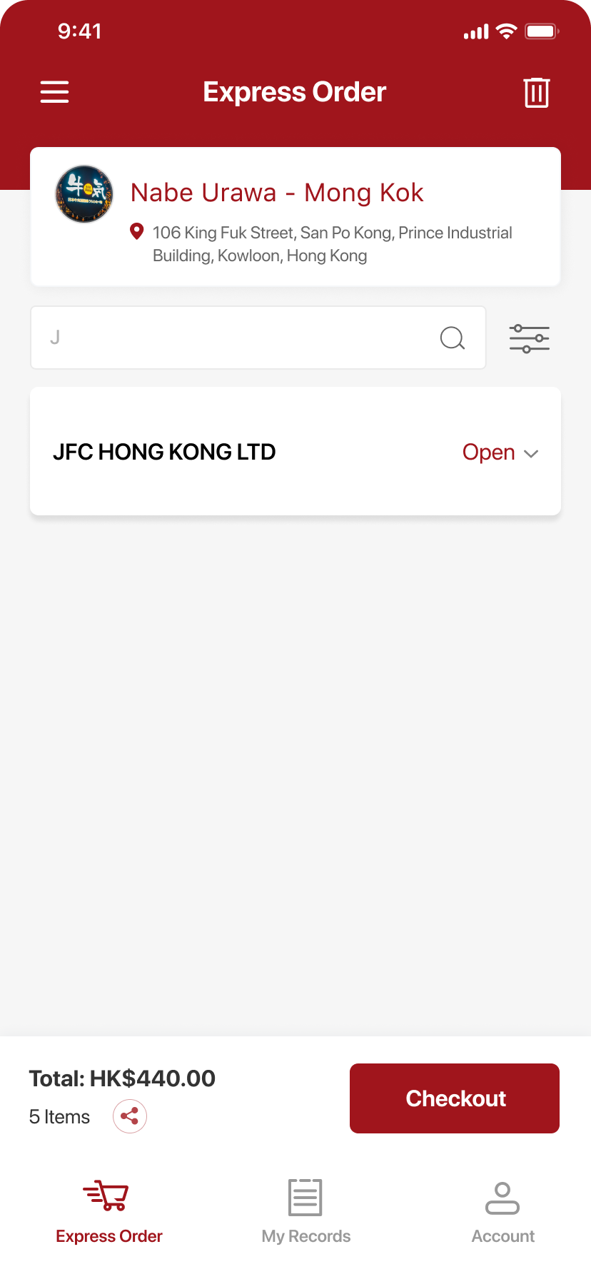
Express Order (Home Page)

Unable to send invoice to other parties
Non Birdymart users will not be able to access to invoices and purchase history
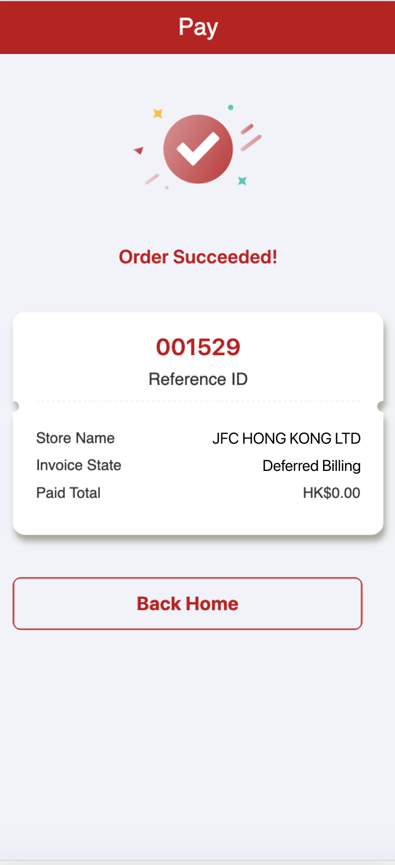
Order Confirmation
Planning & Showcase
With all the findings in mind, few majors changes and features will be made and added to make Birdymart more intuitive and user-friendly to purchasers. Our goals are to:
Improve the UI
Design new features
Improve the UI
As users struggled to complete tasks smoothly and successfully, I wanted to make the Express Order’s UI clearer and more intuitive to use.
In the previous Express Order page, it did not show the total amount of the order and each store’s amount was too light and small to read. Users were unable to remove or adjust the quantity of items. The page also consist of unnecessary information, such as the code ID and the account manager.
Design new features
With our new UI to improve the usability of Birdymart, what other changes and features can I make/ add to enhance the accessibility? The ordering process needed to be shortened and it should allow users to complete all the necessary duties on Birdymart.
By implementing a Search Bar and a Filter, it enables users to get straight to the item/ supplier store, without wasting any time skimming through irrelevant information. A ‘Save’ feature is also added to each items so users can save items that are frequently ordered, and re-order them quickly and easily during their next purchases.
Express Order - UI
BEFORE & AFTER


Search Bar & Filter


We also learned that it’s crucial for some purchasers to report their expenses to the financial department. And what is the point of switching from the traditional ordering process to Birdymart, if users are unable to complete all the necessary steps when ordering?
In order to fulfil the demand, a Sharing feature is added to allows user to send the invoice right after placing an order and on the Purchase History page via Whatsapp and Email.
Order Confirmation
BEFORE & AFTER


Results
The updated prototype of Birdymart is presented to and tested by stakeholders, including the company and the purchasing agent. All participants are satisfied and agreed on the enhanced features and experience.
We saw a significant improvement on the process of ordering, the purchasing agents were able to find the items they needed immediately with the help of the search bar, and created purchase orders smoother comparing to the previous version. Overall, the updated version of Birdymart has been well received by our client.