Motivate people into an exercise routine that suits their busy schedule
Role: UX/ UI Design
Timeline: August - October 2021
Project Type: UI Case Study for CareerFoundry
Introduction
Background
Physical fitness is an essential component of a healthy and satisfying lifestyle. However, ‘It’s boring’, ‘I’m not motivated to begin’ and ‘I don’t have time’ are some common reasons we encounter when we speak to people about fitness. Therefore, I designed a product that motivates people into an exercising habit. Fitter is a responsive web app for users to search and view routines, guides, daily challenges and other information on any device.
Key Objective
Help people to find an exercise of their choice and provide routines, guide, and information
Encourage people who want to get into an easy routine for physical activities
Create fun exercisers that suit each user
We wish everyone can become healthy and enjoy the associated benefits such as having better mood, weight management, reduce risks of illness and learning something new
Research
User Persona
Rebecca represents people who have busy and unhealthy lifestyles and want a change. Rebecca wants to improve her lifestyle and needs a tool like Fitter that will keep her motivated as well
User Stories
SCHEDULE WORKOUT
As a frequent user, I want to be able to schedule exercises for working out, so that I can build a positive habit
DAILY CHALLENGES
As a frequent user, I want to a fun and challenging way to stay motivated
DAY LOG & PROFILE
As a frequent user, I want to track progression and record what I’ve done, so that I can see my progress over time
Planning
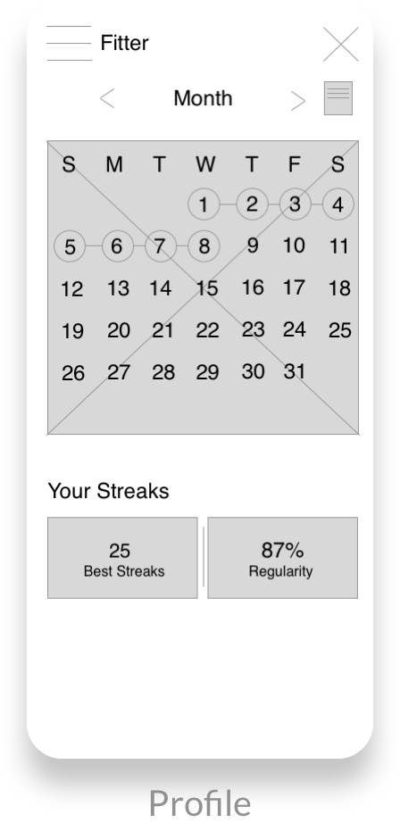
Sketches - Mid-fidelity Wireframes
After finalizing the essential features and screens, I sketched out my ideas digitally on iPad and turned the design into low-fidelity wireframes on Sketch to visualize the layouts
Design Objectives
Straightforward and intuitive to new users
Large space for imagery and description to allow users to have an overview of the workout
Allow users to access to key features (daily challenges & scheduling workouts) on dashboard easily
Moodboard
Once I’ve created the basic structure of Fitter, I moved on to creating two mood boards to explore different visuals and identify what elements are better to encourage and motivate our users to workout regularly
Moodboard #1
Moodboard #2
Moodboard #1 was chosen to be my reference. While moodboard #2 is very calming and smoothing, often used in health and wellness and yoga apps, our key objective is to help users to be more energetic and when referred to our persona Rebecca, she is looking for a fitness app that she can enjoy and motivates her. Warm tone colours and dynamic photos can excite and invites users to do more exercisers, also create an enthusiastic atmosphere.
Style Guide
Orange is chosen to be the primary and dominant colour, as orange tends to be more energetic. As the app contains a lot of images, a monochromatic colour palette is used to keep the design modern and minimalistic and avoid overwhelming the overall design.
A spacing system is also introduced to the design. The spacing, UI elements and fonts etc. will follow a scale of 4px
Margin: 16px
Columns: 6
Gutter Width: 10px
Column Width: 50px
A 6-column grid is used for small devices as this is a minimal design and the elements of the design are rather large and does not consist of a lot of small detail.
Label tells user what sort of information they’re expected to enter.
Error message and different colours are used to reflect user’s actions. Green is commonly used as success and red is commonly used to represent error.
Iteration
Profile
BEFORE & AFTER
The new profile added more information about the user, such as weight, height and profile picture, to further personalize the user profile and help motivate users.
Filter
BEFORE & AFTER
In the new filter, all the filter options are shown on the screen. Users can view all options at once and choose what suits them quicker and easier.
The refined design also helps users who are not familiar with workouts, to see all their options without expanding all the tabs one by one to check.
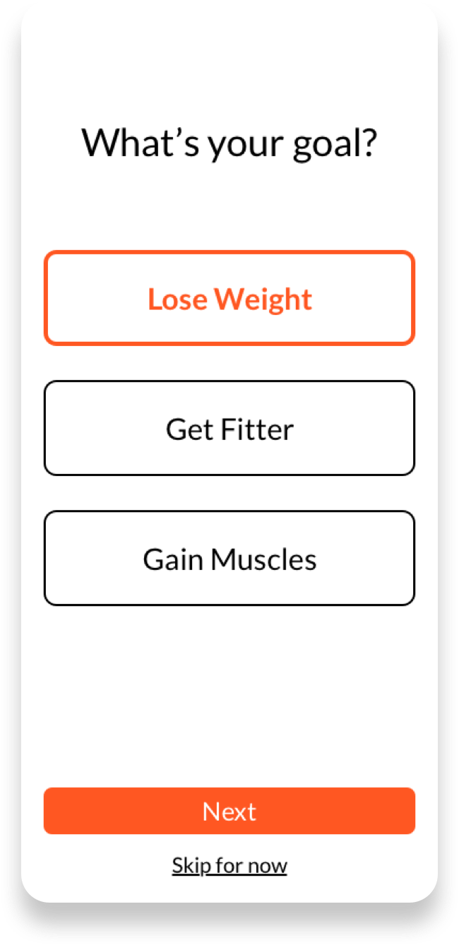
Sign-up Page
BEFORE & AFTER
A ‘Skip for now’ button is added for users who do not want to choose any options at the moment, or unsure which to select.
Users can choose or change their goals or information later in the profile.
Breakpoints
Fitter is a responsive web application which follows a mobile-first approach. Therefore, I created two breakpoints for the tablet (768px) and desktop (1440px).
Profile
Search Result
Workout Overview
Showcase
Personalized Workout & Challenge Recommendation
Fitter will recommend workouts and challenges based on users goals and personal information
Workout Menu & Overview
Workouts are categorized and organized in a way users can find their desired workout routines by choosing the types and areas of workout.
Each overview provides a clear duration, equipments needed for the workout and a brief description of the workout, for users to decide if the workout suits them easily.
Schedule Workouts
Users can schedule workouts by adding sessions to their personal calendar. Users can also set their workouts on repeat so they do not have to re-schedule every week.
Daily Challenges
New users can customize their everyday challenges, from physical fitnesses like walking steps and yoga, to mental health practices like meditations, to encourage people to get in an easy routine.
Final Thoughts
Future Iteration
In the future, I would like to add more interactions and animations to make the design more interesting and enjoyable to use. I would also like to conduct usability tests to collect users’ feedback and further improve the design.
Challenges
Creating different breakpoints was challenging to me at first, as I struggled with matching the grid and the design. But after researching and referring back to Bootstrap’s layout/grid reference is really helpful, I learned more about the relationship between breakpoints, grids and the design.
What I Learned
As I’ve taken a mobile-first approach in this project, I have to be more careful to identify and pick the most essential content to include on the screen, as mobile devices have the smallest screen.


