Wake up, this is your stop!
Role: UX Design
Time: 2 hours
Prompt
Have you ever tried to take a short nap on the train only to wake up and find yourself at the end of the line? How can you help passengers wake up just before the train arrives at their station?
My Process
Assumptions
Problem Statement
Research
Personas
User Flows
Sketches + Wireframes
Assumptions
As there are not much information and instructions given, I had to make some reasonable assumptions to create a design that helps wake passengers up before their stations
Users are probably busy and tired individuals who often fall asleep on the train
Assuming users are familiar with transportation apps to check for routes and transportation schedules
Assuming users are used to using the “Alarm” app on their phones to wake them up in the morning
Problem Statement
Passengers need an easy way to remind them to wake up before the train arrives at their stations because they often fall asleep during the ride and miss the stop.
Research
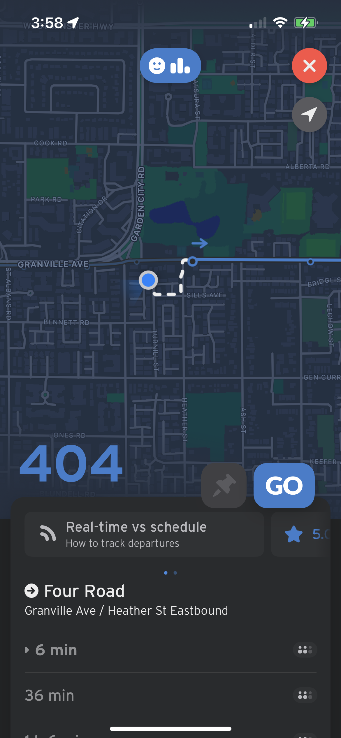
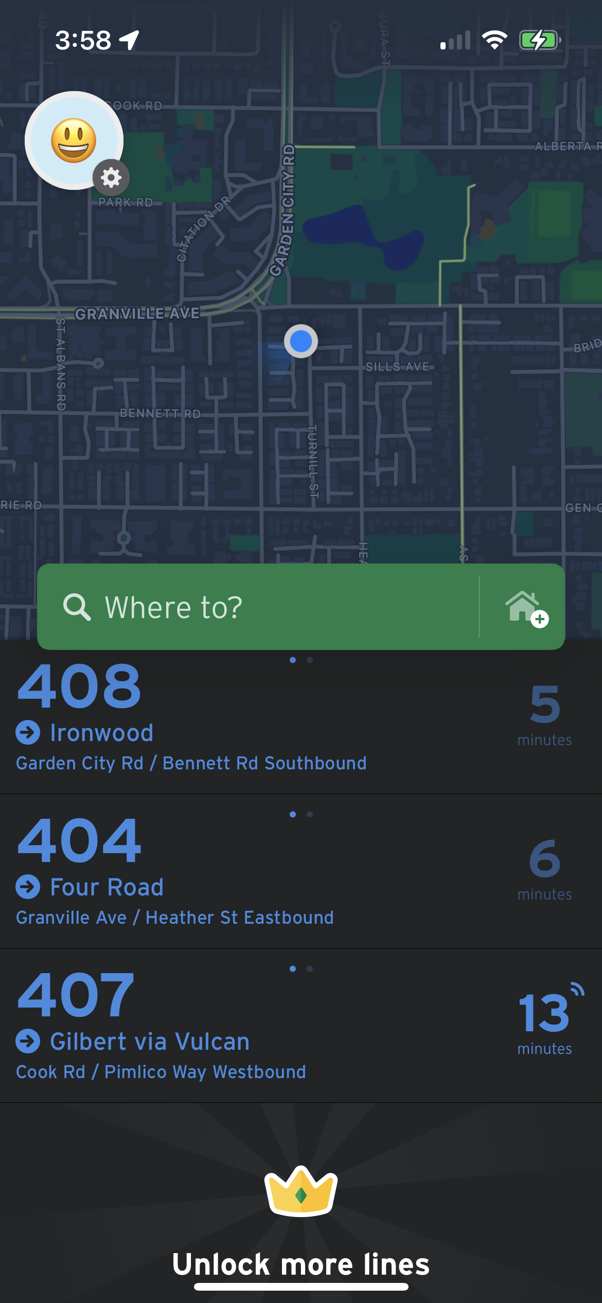
Based on the assumptions, I did some research on multiple apps to understand user behaviours, for example, most Apple users use ‘Alarm’ on phones to set alarms and reminders, and passengers would use apps like “Google map’ to check for routes and transportation schedules. In BC, Canada in particular, lots of passengers use “Transit” for the same purpose.
Transit
My thoughts/ Notes:
I like how it shows nearby transportation and arrival times on the front page.
when swiping on the bus card, it shows the opposite direction of the bus
it shows more information about the bus when clicking on the bus no., eg. the arrival time of the next three buses, and all stops
KMB . LWB
My thoughts/ Notes:
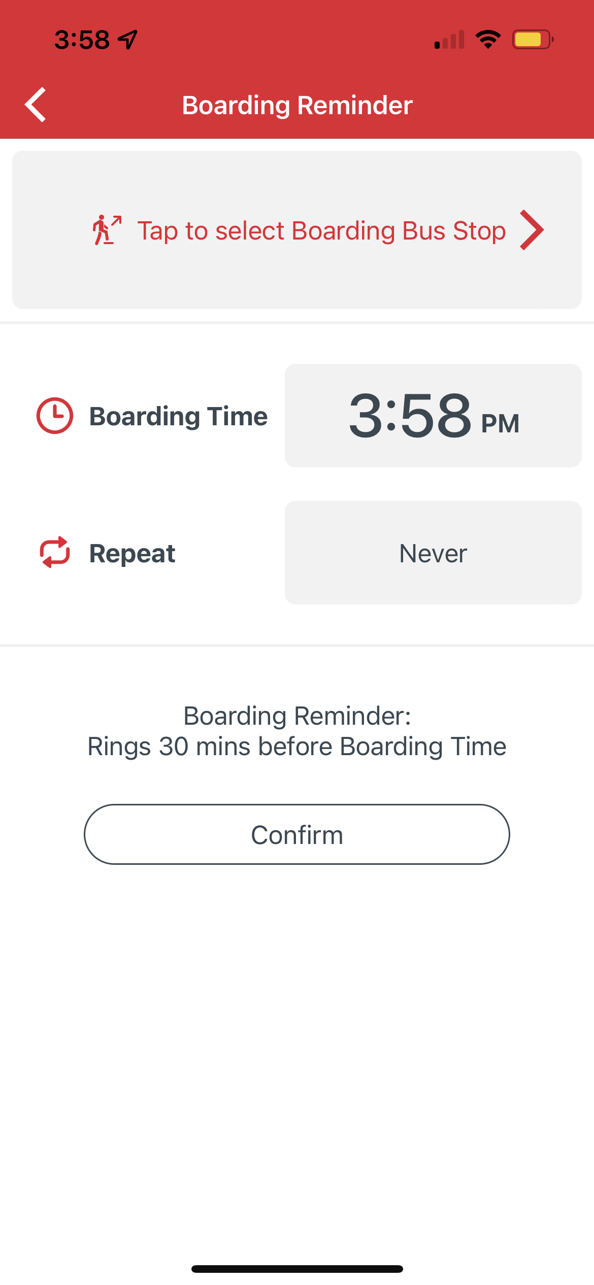
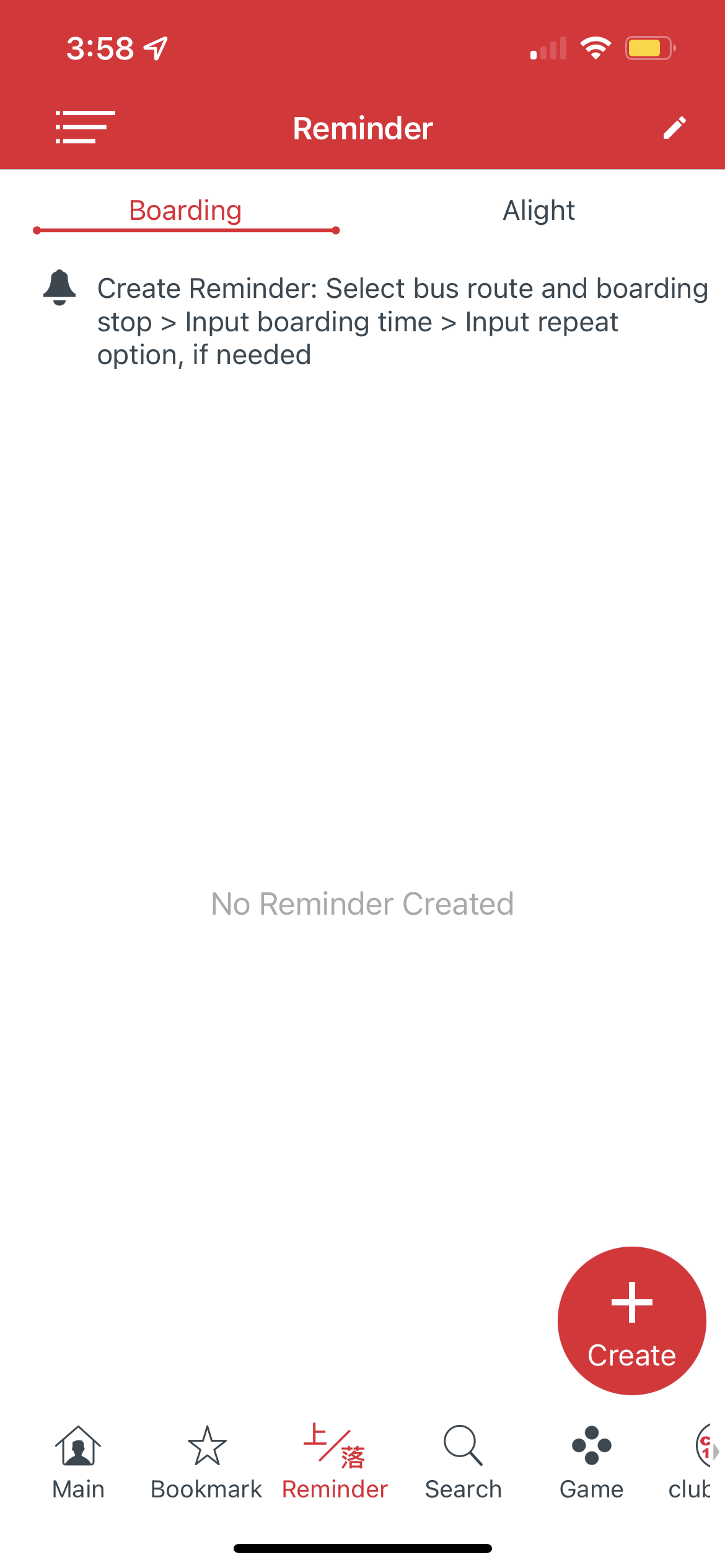
KMB . LWB is a transportation app used in Hong Kong
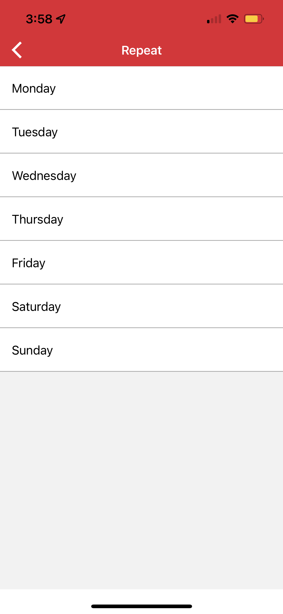
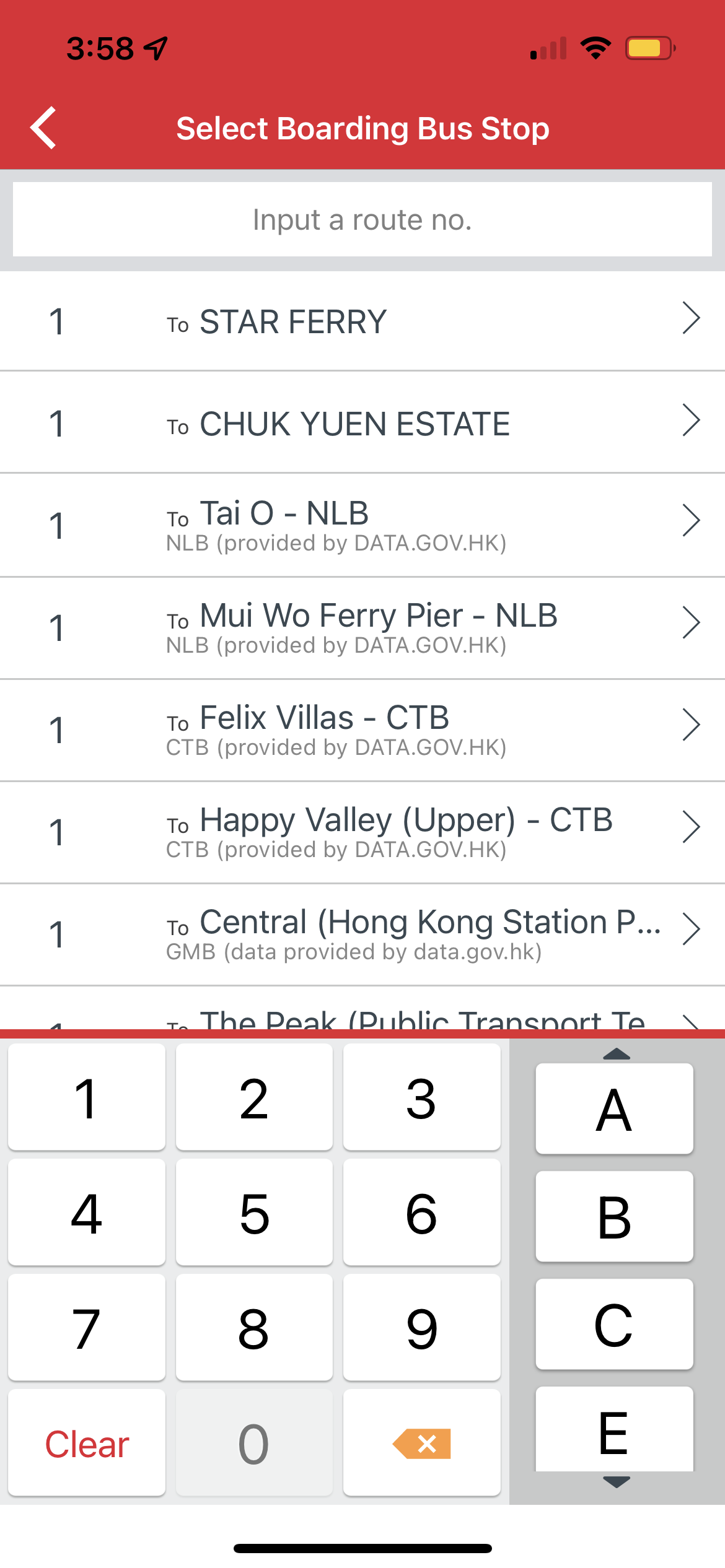
Passengers can check for bus routes and time schedules. Also, it allows passengers to set reminders of the bus departure time
I like that the page explains how the Reminder feature works, but I think it’s a bit repetitive that users have to enter the route no. again instead of selecting the stop only
My thoughts/ Notes:
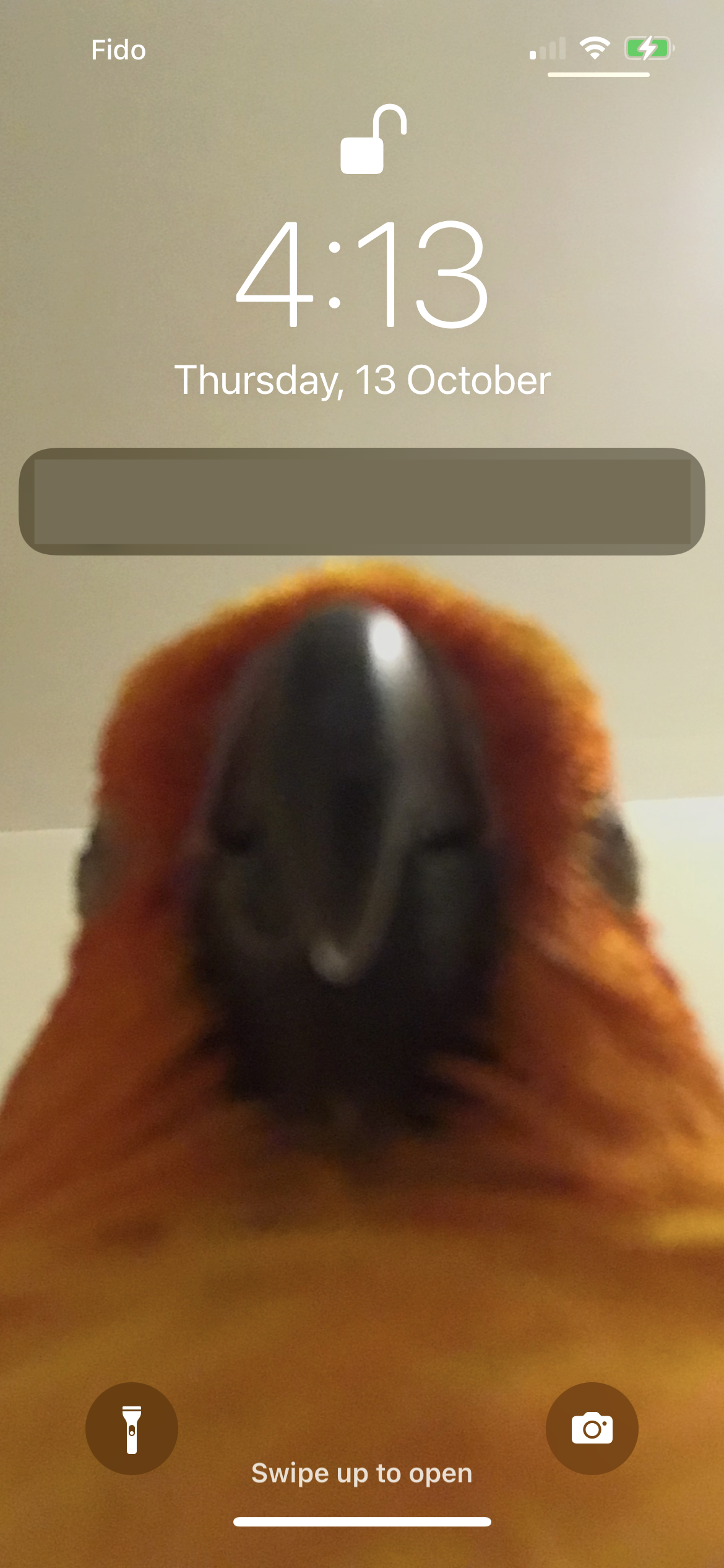
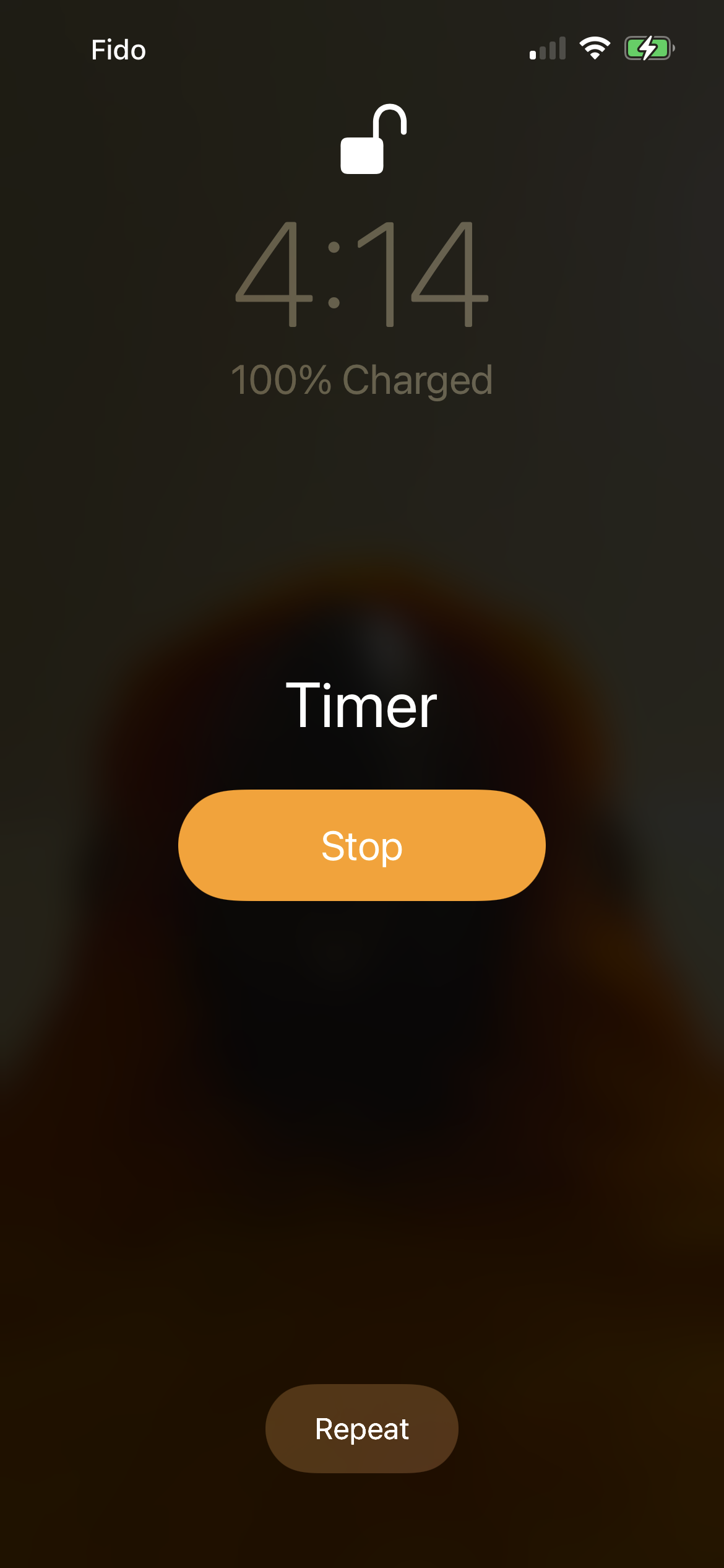
Alarm/ Timer - Phone rings and vibrates until the user turns is off
Notification - Phone rings/ vibrates only once, notification allows texts
Alarm/ Timer is an easier but more aggressive way of waking up someone who’s napping (I think we all have that experience where the alarm gives us a jump scare), also a constant ring might disturb other passengers
Types of reminders
Notification
Alarm/ Timer
(Yes, this is a cute angle of my parrot
Persona
User Flow
Open App
Select nearby transportation/ Search locations, routes
Set reminder
Get on transit
Fall Asleep
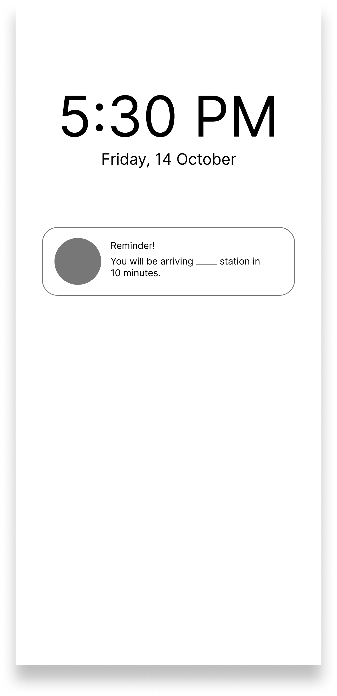
Receive notification + ringtone/ vibration (Repeat if enabled repeat)
Get off transit
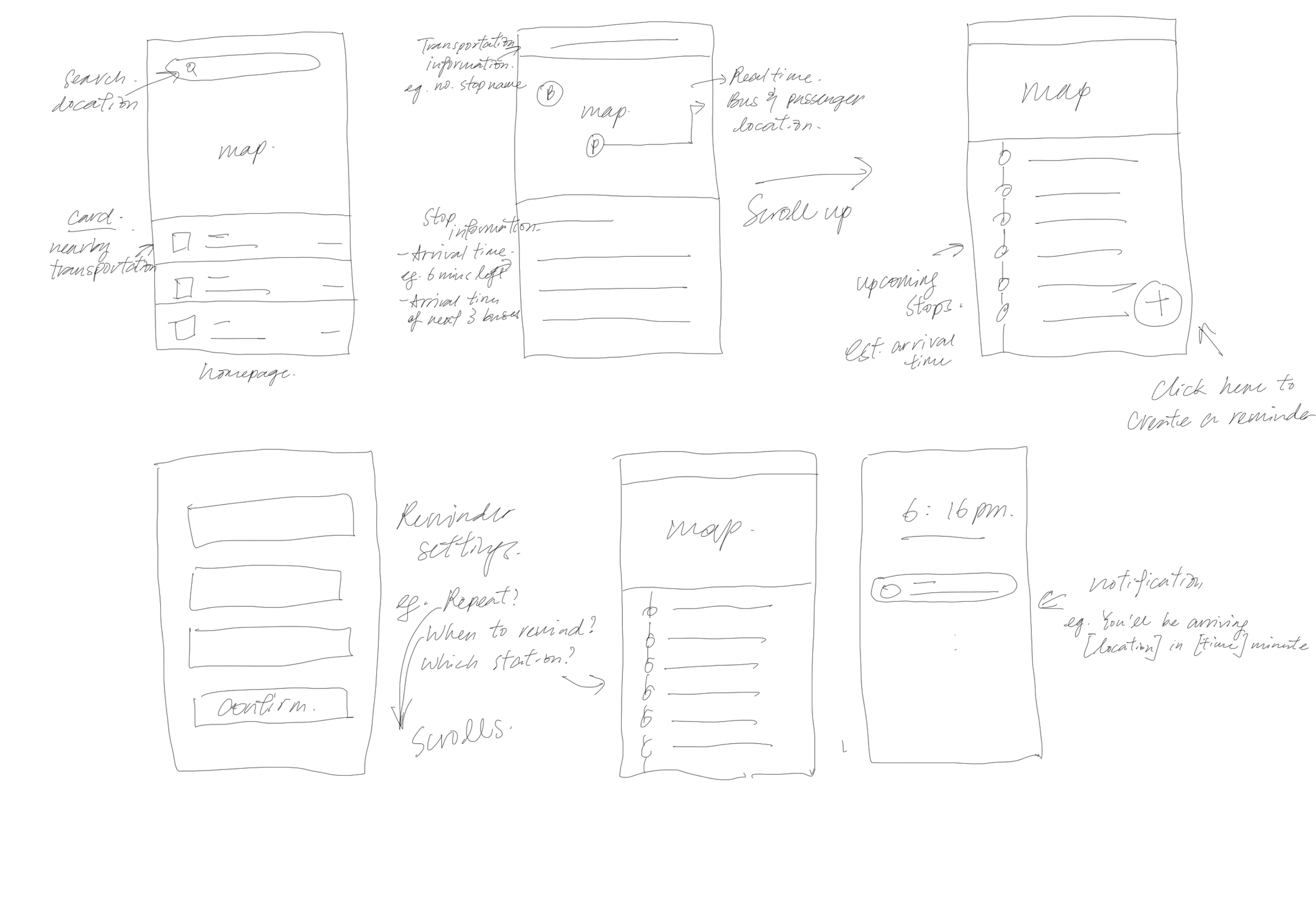
Sketches
Questions to keep in mind while designing:
when is the best time to allow users to add a reminder?
what information should be imputed by users?
what if users did not wake up after the first reminder?
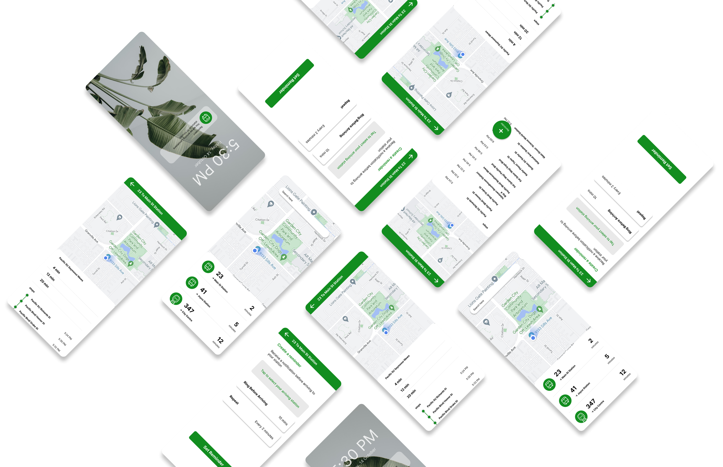
The Solution (Wireframe)
Reminders can be created when users select a transit, therefore users only need to select their arriving station and not the departure location
A floating button is used for the “Add Reminder” is used to keep the layout clean
Summary
As I only gave myself one and a half hour max to complete this whiteboard challenge, the biggest limitation of this challenge is time.
If I were to take this challenge to the next step, I would like to have some interviews with people who take transportation often and people who had experiences with different transportation/ map apps. That way I could gain more context about the situation, user behaviours and real-life experiences of using other apps.
I would love to create a high-fidelity wireframe and create a basic prototype of the whole process of adding a reminder.
